This image has so many things right with it. Her pose, her strong, muscular, powerful back and arms. The intense emotions of regret and sadness. But then Ed Benes goes and ruins it by exposing her arse. If he had just given her some pants that covered her arse cheeks, this would be beautiful. Unfortuantely the emotion and power is mocked by Benes apparent pathological need to display women's arses.
Showing posts with label bad art. Show all posts
Friday, January 04, 2013
Not a Wonder Woman Wednesday
This image has so many things right with it. Her pose, her strong, muscular, powerful back and arms. The intense emotions of regret and sadness. But then Ed Benes goes and ruins it by exposing her arse. If he had just given her some pants that covered her arse cheeks, this would be beautiful. Unfortuantely the emotion and power is mocked by Benes apparent pathological need to display women's arses.
Sunday, May 20, 2012
Super Silly Sunday
I'm still alive...!!
I recedntly read a few Teen Titans series and was struck by the ridiculousness of some of them. The series is by Judd Winick and Ian Churchill. Now, i usually like Judd Winick, or at least, I liked his Green Arrow run, a lot, and I like Batwing, but these stories were mediocre. As for Churchill, he's a porr man's Michael Turner, without any of the life or movement. The following scans are the final pages issues 1, 2, 4, 5, 6 and 7 respectively. 5, 6 and 7 are the final panels on each page, which took up the bottom half of each page.
Monday, November 14, 2011
Definitely not a Wonderful Wonder Woman Wednesday
Dear artists.
Pants like you've drawn on Wondy here won't stay like that. The gusset will shift about and expose her labia. The only way it won't is if it's pulled really really tightly and then you'll probably see her labia anyway, and quite possibly it will cause a serious chafing injury.
Please, draw underwear sensibly, even if it's outerwear.
Thank you.
Also, those poses are candidates for Escher Girls.
Regards,
Saranga
Pants like you've drawn on Wondy here won't stay like that. The gusset will shift about and expose her labia. The only way it won't is if it's pulled really really tightly and then you'll probably see her labia anyway, and quite possibly it will cause a serious chafing injury.
Please, draw underwear sensibly, even if it's outerwear.
Thank you.
Also, those poses are candidates for Escher Girls.
Regards,
Saranga
Friday, October 21, 2011
Definitely not a Wonderful Wonder Woman Wednesday
Saturday, September 24, 2011
An article on those Catwoman/Starfire comics
It's good, and can be read here. Some of the comments are horrible. Seth Vlan has a good point when he says that:
"Which brings me to my second point; nearly EVERY SINGLE MALE in comics drawn with an Olympian physique that's every bit as offensive as the equally exaggerated proportions of female characters. According to these comics, even Reed Richards could beat me at arm-wrestling without resorting to his stretchy powers. If you can't see that, if you can't even try to understand what it's like to constantly be told that you need to have huge muscles and bed lots of women to earn respect, then you're a hypocrite of the highest order, maim."
Apart from the last sentence which is rude, he has a point. Then he continues with:
"As for how you view "sexually liberated women", stop hiding your true feelings. At the end of the day, you just don't like it when women go to bed with TOO MANY men. Probably because no one gives you the opportunity"
Whichmakes Mr Vlan a bit of a dick really. Patriarchy and sexism hurts everyone. To make a generalisation, under the patriarchy women get objectified to look like sexed up vacant dolls, men get objectified to look like strong muscle men. These actions help no one.
Tuesday, September 20, 2011
New Eschergirls tumblr!
The wonderful Ami Angelwings has started a tumblr, titled Eschergirls, showcasing crap comic art. Actually the tagline is: 'Float like a butterfly, sting like a WTF!? This is a blog for female characters in impossible or ridiculous poses because the artsist need to show teh sexy'
It's highly amusing. Here are some fetaured pictures, but bear in mind that as with most tumblrs the brilliance is in the commentary:
Go check it out!
It's highly amusing. Here are some fetaured pictures, but bear in mind that as with most tumblrs the brilliance is in the commentary:
Go check it out!
Sunday, February 27, 2011
Last batch of reviews...
Green Arrow 9 - hot damn this has gotten enjoyable. Not great, not a masterpiece, but enjoyable. I still do not care for the art though, inside and out. The cover is terrible. Etrigan looks like he has breasts, if this was soem bodl new direction where he was actually going to develop both male and female attributes I'd like it. However it's not, it's beefy muscles gone mad.
Yuck.
Gotham City Sirens 20 - a victory for Harley. She's ingenious, driven and bright. I really look forward to seeing how this turns out.
Teen Titans 92 - Jeanty a la Buffy portrait atrist extraodinaire did the pencils on this issue. This meant I kept thinking the Buffster had replaced Cassie, and that Xander had snuck in and painted himself green. Tthat was bizarre. Damian has left the team and this makes me sad.
Batman: The Brave & The Bold #4 - Bats and Wondy get hitched. 'Nuff said!
Yuck.
Gotham City Sirens 20 - a victory for Harley. She's ingenious, driven and bright. I really look forward to seeing how this turns out.
Teen Titans 92 - Jeanty a la Buffy portrait atrist extraodinaire did the pencils on this issue. This meant I kept thinking the Buffster had replaced Cassie, and that Xander had snuck in and painted himself green. Tthat was bizarre. Damian has left the team and this makes me sad.
Batman: The Brave & The Bold #4 - Bats and Wondy get hitched. 'Nuff said!
Saturday, February 12, 2011
End of January Comic reviews
Spoilers ahead
Gotham City Sirens #19
Good cover. Shame the story is all about the Siren's love lives. Sigh. I do not want my book about a group of women to be about their romantic entanglements. Can we have more of the Birds of Prey style writing here please.
JLA #53
I'm coming in at the tail end of this story arc, and it surprises me how good it is. It's a solid comic, well adapted to it's short 22 page format, but one that will, I suspect, read just as well in a trade. Dark Supergirl isn't really too dark, just a bit snarky. She's not all out for evil and doom, not like she was in her introductory trade. It's refreshing.
Now, as soon as DC clarify where dark Supergirl fits into regular Supergirl continuity I'll be happy.
Superboy #4
I may be feeling a little out of sorts today, but I am not thrilled with this art. There's not enough detail in the faces. This blog post talks about how women's faces are drawn with less pencil lines than men's faces, therefore they are more difficult to draw. It's not a stance I particularly agree with, especially as a lot of the motivation for not putting in detail seems to be that less detail = beauty, and women = beauty.
Anyway, reading this comic makes me think of this post, as there's fuck all pencil detail on Connor's and other character's faces. Any nuance comes from the colourist. It's not an approach I care for.
Other than the art, the issue is good.
Secret Six #30
I have no fucking clue what is going on here. The Doom patrol turns up, a lazy disaffected 23 year old decides to become an old style king of crime, and the Six are on Oolong Island, where everything converges.
Oh and Bane is taken to a strip club and there he meets 3 twitterati. No really! Gail Simone gave a cameo to @pseudicide (Dee) @ceebee_eebee (Elyssa) and @harleyquinnaid (Elise). I chat to pseudicide and ceebee_eebee quite a lot on twitter. They are adorable. So, the panels with them in kind of made this comic for me. :D
Brightest Day #19
Aquawar! AquaWar! AquaWAAAAAAAAAAAAAAAAARRRRRRRRRRRRRRRR!
Oh hells yeah. Bring on the Aqua goodness. And oh look, Arthur's lost a hand. Again. How careless of him. ;)
Gotham City Sirens #19
Good cover. Shame the story is all about the Siren's love lives. Sigh. I do not want my book about a group of women to be about their romantic entanglements. Can we have more of the Birds of Prey style writing here please.
JLA #53
I'm coming in at the tail end of this story arc, and it surprises me how good it is. It's a solid comic, well adapted to it's short 22 page format, but one that will, I suspect, read just as well in a trade. Dark Supergirl isn't really too dark, just a bit snarky. She's not all out for evil and doom, not like she was in her introductory trade. It's refreshing.
Now, as soon as DC clarify where dark Supergirl fits into regular Supergirl continuity I'll be happy.
Superboy #4
I may be feeling a little out of sorts today, but I am not thrilled with this art. There's not enough detail in the faces. This blog post talks about how women's faces are drawn with less pencil lines than men's faces, therefore they are more difficult to draw. It's not a stance I particularly agree with, especially as a lot of the motivation for not putting in detail seems to be that less detail = beauty, and women = beauty.
Anyway, reading this comic makes me think of this post, as there's fuck all pencil detail on Connor's and other character's faces. Any nuance comes from the colourist. It's not an approach I care for.
Other than the art, the issue is good.
Secret Six #30
I have no fucking clue what is going on here. The Doom patrol turns up, a lazy disaffected 23 year old decides to become an old style king of crime, and the Six are on Oolong Island, where everything converges.
Oh and Bane is taken to a strip club and there he meets 3 twitterati. No really! Gail Simone gave a cameo to @pseudicide (Dee) @ceebee_eebee (Elyssa) and @harleyquinnaid (Elise). I chat to pseudicide and ceebee_eebee quite a lot on twitter. They are adorable. So, the panels with them in kind of made this comic for me. :D
Brightest Day #19
Aquawar! AquaWar! AquaWAAAAAAAAAAAAAAAAARRRRRRRRRRRRRRRR!
Oh hells yeah. Bring on the Aqua goodness. And oh look, Arthur's lost a hand. Again. How careless of him. ;)
Monday, November 15, 2010
In defence of Cry For Justice
Caution - big spoilers ahead.
.
.
.
.
.
.
.
.
I decided to re-read it the other day, for the humour. And then I realised something, so many bloggers talk about it like it's absolute crap, but that's not a particularly accurate representation of it.
I admit, when I first read it I found the first few issues hilarious. The dialogue and the narration seemed quite, quite funny, and not intentionally so. On a re-read, with the benefit of hindsight and having had time to mull it over, I can see more nuances in it that I didn't see before.
Some of the narration in the first couple of issues if pretty dire, especially that around Congorilla and Mik. The dialogue, on the other hand shows real wit and a deft handling of (some of) the characters. A lot of it is banter - teasing between friends, mocking each other, being comfortable with each other. It seems to me to portray a group of people who are comfortable in themselves and with each other and have the confidence within them to speak as they see fit. A lot of the dialogue is very natural. It showed to me how Robinson could be really really good, and probably was in Starman.
Ollie's repetition of 'Oh Boy' in issue number 1 seems real, as does Dinah's reaction to him. What doesn't fit later on is when Ollie tells Dinah 'Pretty bird..you've just turned real ugly' because Dinah told him off for running off with Hal. I don't think Ollie should be that cruel and petulant.
There are still things I don't like - Ray Palmer using torture, the killing and skinning of the Tasmanian Devil, Roy's maiming and Lian's death (which wasn't fully explored and was, I still feel, dealt with badly). Ollie and Hal deciding to go on another walkabout also didn't make a lick of sense, especially Ollie. To reconcile this in my head I think I shall have to believe that Ollie has been pining for the old days and has wanted to do something different and juvenile, so Hal's offer came along at just the right time.
I am pleased by Kara's detective powers in the series, not just as a Kara fan but also because It would seem to complement and back up her science training as seen in her own book. I am not best pleased by her crying as soon as Hal questioned her motives - that seemed bizarre. Although possibly it could have been improved with a different artist - imagine her being shown to be crying tears of frustration instead of sorrow. Compare this with Kara's developing crush on Freddie which was nicely handled.
The other thing which impressed me as much as it did the first time, was Donna saving the day. Despite being crucified to a wall, despite being shot in the leg with an arrow, the way she barrelled through there and took Prometheus down took my breath away. That is the single most impressive thing I have seen Donna do, and it was joyous. It gave me new respect for her as a character.
The last couple of things to mention about the plot (and then I will move onto the art) is that on a re-read, with knowledge of the new Justice League about to be formed, this story makes a lot more sense. You can see why and how things were set up the way they were and it feels more satisfying when you know where it will lead.
Then there's Ollie killing of Prometheus - I wrote at the time this issue came out that this did seem in character for Ollie. In his own book he'd been getting darker and more savage for a long time. I didn't particularly like this new direction, I prefer a happier, confident more carefree Ollie, but we got some good stories out of it and I continued to read and enjoy it. On re-read, I still think that this is in character for him, as he was being written at the time.
Now, the art. I think this book would have been very much improved (for myself), with a different artist(s).
Mauro Cascioli does paint some very pretty pictures, but there's not a lot of movement in them. It's static - each panel looks like a snapshot. I prefer my comic art to have an air of movement about it. He also doesn't always manage to convey expressions or feelings to the same degree that simpler, less complicated pencil lines can do. For me, this is a negative. Others may feel differently. Then there's his tendency to draw women's costumes with really high knicker lines, to the extent that I can tell they've all shaved or waxed to at least a Brazilian standard, if they haven't had it all taken off. This is purely a political viewpoint of mine, I don't expect everyone else to agree with it. On the plus side, although he can't draw realistic clothes (in terms of how they hang and fold) the bodies he draws are of a more realistic body shape, which is something that simpler drawings always achieve.
For the last 3 issues we had Scott Clark provide a lot of the art. It appears that Clark is trying to ape Cascioli's style but he doesn't quite have the ability or finesse to pull it off. The art isn't detailed enough, there's less character and expression in his subject's faces and the women are even more (and needlessly) sexed up. There's a particularly bad panel of Speedy, here, where for some reason she appears to be posing on a rooftop with her bow. It would make more sense if she had an arrow in her hand, but she doesn't.
, fun fluff. It's not groundbreaking. The idea of heroes stopping the bad guys before they do something really bad was done in Justice League Elite. There's lots of bad editorial decisions, but I can see why Robinson has so many fans. There's a hint of greatness in there that was stifled and overshadowed by many poor events.
.
.
.
.
.
.
.
.
I decided to re-read it the other day, for the humour. And then I realised something, so many bloggers talk about it like it's absolute crap, but that's not a particularly accurate representation of it.
I admit, when I first read it I found the first few issues hilarious. The dialogue and the narration seemed quite, quite funny, and not intentionally so. On a re-read, with the benefit of hindsight and having had time to mull it over, I can see more nuances in it that I didn't see before.
Some of the narration in the first couple of issues if pretty dire, especially that around Congorilla and Mik. The dialogue, on the other hand shows real wit and a deft handling of (some of) the characters. A lot of it is banter - teasing between friends, mocking each other, being comfortable with each other. It seems to me to portray a group of people who are comfortable in themselves and with each other and have the confidence within them to speak as they see fit. A lot of the dialogue is very natural. It showed to me how Robinson could be really really good, and probably was in Starman.
Ollie's repetition of 'Oh Boy' in issue number 1 seems real, as does Dinah's reaction to him. What doesn't fit later on is when Ollie tells Dinah 'Pretty bird..you've just turned real ugly' because Dinah told him off for running off with Hal. I don't think Ollie should be that cruel and petulant.
There are still things I don't like - Ray Palmer using torture, the killing and skinning of the Tasmanian Devil, Roy's maiming and Lian's death (which wasn't fully explored and was, I still feel, dealt with badly). Ollie and Hal deciding to go on another walkabout also didn't make a lick of sense, especially Ollie. To reconcile this in my head I think I shall have to believe that Ollie has been pining for the old days and has wanted to do something different and juvenile, so Hal's offer came along at just the right time.
I am pleased by Kara's detective powers in the series, not just as a Kara fan but also because It would seem to complement and back up her science training as seen in her own book. I am not best pleased by her crying as soon as Hal questioned her motives - that seemed bizarre. Although possibly it could have been improved with a different artist - imagine her being shown to be crying tears of frustration instead of sorrow. Compare this with Kara's developing crush on Freddie which was nicely handled.
The other thing which impressed me as much as it did the first time, was Donna saving the day. Despite being crucified to a wall, despite being shot in the leg with an arrow, the way she barrelled through there and took Prometheus down took my breath away. That is the single most impressive thing I have seen Donna do, and it was joyous. It gave me new respect for her as a character.
The last couple of things to mention about the plot (and then I will move onto the art) is that on a re-read, with knowledge of the new Justice League about to be formed, this story makes a lot more sense. You can see why and how things were set up the way they were and it feels more satisfying when you know where it will lead.
Then there's Ollie killing of Prometheus - I wrote at the time this issue came out that this did seem in character for Ollie. In his own book he'd been getting darker and more savage for a long time. I didn't particularly like this new direction, I prefer a happier, confident more carefree Ollie, but we got some good stories out of it and I continued to read and enjoy it. On re-read, I still think that this is in character for him, as he was being written at the time.
Now, the art. I think this book would have been very much improved (for myself), with a different artist(s).
Mauro Cascioli does paint some very pretty pictures, but there's not a lot of movement in them. It's static - each panel looks like a snapshot. I prefer my comic art to have an air of movement about it. He also doesn't always manage to convey expressions or feelings to the same degree that simpler, less complicated pencil lines can do. For me, this is a negative. Others may feel differently. Then there's his tendency to draw women's costumes with really high knicker lines, to the extent that I can tell they've all shaved or waxed to at least a Brazilian standard, if they haven't had it all taken off. This is purely a political viewpoint of mine, I don't expect everyone else to agree with it. On the plus side, although he can't draw realistic clothes (in terms of how they hang and fold) the bodies he draws are of a more realistic body shape, which is something that simpler drawings always achieve.
For the last 3 issues we had Scott Clark provide a lot of the art. It appears that Clark is trying to ape Cascioli's style but he doesn't quite have the ability or finesse to pull it off. The art isn't detailed enough, there's less character and expression in his subject's faces and the women are even more (and needlessly) sexed up. There's a particularly bad panel of Speedy, here, where for some reason she appears to be posing on a rooftop with her bow. It would make more sense if she had an arrow in her hand, but she doesn't.
, fun fluff. It's not groundbreaking. The idea of heroes stopping the bad guys before they do something really bad was done in Justice League Elite. There's lots of bad editorial decisions, but I can see why Robinson has so many fans. There's a hint of greatness in there that was stifled and overshadowed by many poor events.
Thursday, June 10, 2010
Respectful to crass
Remember what I was banging on about in my Superman/Batman review last week? Well I scanned the offending artwork.
Seriously, how do you go from this:
To this:
I ask again, why has Lois got her bra out just when she's about to be burnt at the stake?
Seriously, how do you go from this:
To this:
I ask again, why has Lois got her bra out just when she's about to be burnt at the stake?
Monday, February 08, 2010
Buffy's a fucking superhero!
Yeah I don't hold with not swearing. Spoilers ahead for Superman: World of New Krypton #12 (last one! sob), Red Robin #9 (still so very good), Blackest Night: Wonder Woman #3 (some wtfery moments there), The Question: Blackest Night #37 (resurrected title) (surprisingly quality), Buffy the Vampire Slayer #32 (this was so written for comics nerds, I loved it).
.
.
.
.
.
.
.
.
.
.
.
.
.
.
.
.
Superman: World of New Krypton #12
Oh my lord, this finally finished. I feel all sad now. Once Blackest Night, Flash Rebirth and Cry for Justice is over I'll only be getting 8 titles a month. :o How bizzare. Anyway, onto the review!
We find out who is behind the shootings on New Krypton. The story was going really well until this point. Then it seemed that this guy was made to be the villain purely to test Kal's faith in Kryptonity (like humanity, but with Kryptonians, I'm not sure what the correct grammatical form would be, help me out if you know). It felt rather shoehorned in and wasn't remotely neccessary to the plot. I mean, I know we've now got another link with General Lane established, but we already know he had links on Krypton, and personally, I think Zod's been chatting up Lane anyway.
Given the final cliffhanger is Brainiac coming back and threatening New Krypton, the inclusion of the traitor felt badly delivered and badly handled. A shame, as otherwise I have really enjoyed this series.
Red Robin #9
Oh Timmy! He's happy again! He hugged Kon, he talked about Bart and he has a crush on Tam! Oh i've missed happy Tim, angsty Tim is understandable and wasn't so bad, but it looks like we'll soon have the old team back! :D :D :D Second most enjoyable comic of the week. And crossing over with the next Batgirl issue, so I think I will actually add Batgirl to my pull list. I've missed the last issue but I should be able to get hold of a copy.
Blackest Night: Wonder Woman #3
Still in a fucking stupid costume, but that doesn't stop her being all serene and majestic. I like Diana. She's very calm when she's taking out the Black Lanterns. So, Di tries to save Mera from the Red ring and they share a glimpse into each other's psyche where it is revealed that Diana actually loves Batman. Hmm. Seems I was wrong when I said she was just being friendly with the kiss. I wonder if she loves Green Arrow too? I have no clue what Mera's big secret is, the art showed us nothing.
The Question: Blackest Night #37 (resurrected title)
As I said, surprisingly good. It's Renee vs Shiva vs Black Lanterns. It's always a trreat to see Shiva.
Buffy the Vampire Slayer #32
Best of the week, by a mile. Buffy gets fucking superpowers! Faster than a speeding bullet, able to leap tall buildings in a single bound and flying like a bird sort of superpowers. No heat vision though, or phasing, or teleportation, or adamantium claws, or solving mysteries (wait that's not a power), or web spinning, or armour building.
Why yes, Xander asked abotu every single one of those. C'mon, admit it, you'd all do the same if a friend of yours got superpowers. Plus, there's a Goonies joke, a Superman movie reference, a Joshua reference (which I really don't understand), and Warren has built a machine from a DC comic! A Simonson deisgn, an X-Men/TT crossover (I think they threw X-Men in for copyright reasons), and they talk about Darkseid. To me, it looks like the machine from the 1st crisis.
Oh and Buffy's got her powers because lots of Slayers who are dying and she's inheriting their strength etc. Which is taken right from the Straczynski Power comics.
So this comic nerd very much enjoyed this issue. It was all about the superhero tropes and it was fantastic. Oh, ansd go read this review for more nerdy squealing.
.
.
.
.
.
.
.
.
.
.
.
.
.
.
.
.
Superman: World of New Krypton #12
Oh my lord, this finally finished. I feel all sad now. Once Blackest Night, Flash Rebirth and Cry for Justice is over I'll only be getting 8 titles a month. :o How bizzare. Anyway, onto the review!
We find out who is behind the shootings on New Krypton. The story was going really well until this point. Then it seemed that this guy was made to be the villain purely to test Kal's faith in Kryptonity (like humanity, but with Kryptonians, I'm not sure what the correct grammatical form would be, help me out if you know). It felt rather shoehorned in and wasn't remotely neccessary to the plot. I mean, I know we've now got another link with General Lane established, but we already know he had links on Krypton, and personally, I think Zod's been chatting up Lane anyway.
Given the final cliffhanger is Brainiac coming back and threatening New Krypton, the inclusion of the traitor felt badly delivered and badly handled. A shame, as otherwise I have really enjoyed this series.
Red Robin #9
Oh Timmy! He's happy again! He hugged Kon, he talked about Bart and he has a crush on Tam! Oh i've missed happy Tim, angsty Tim is understandable and wasn't so bad, but it looks like we'll soon have the old team back! :D :D :D Second most enjoyable comic of the week. And crossing over with the next Batgirl issue, so I think I will actually add Batgirl to my pull list. I've missed the last issue but I should be able to get hold of a copy.
Blackest Night: Wonder Woman #3
Still in a fucking stupid costume, but that doesn't stop her being all serene and majestic. I like Diana. She's very calm when she's taking out the Black Lanterns. So, Di tries to save Mera from the Red ring and they share a glimpse into each other's psyche where it is revealed that Diana actually loves Batman. Hmm. Seems I was wrong when I said she was just being friendly with the kiss. I wonder if she loves Green Arrow too? I have no clue what Mera's big secret is, the art showed us nothing.
The Question: Blackest Night #37 (resurrected title)
As I said, surprisingly good. It's Renee vs Shiva vs Black Lanterns. It's always a trreat to see Shiva.
Buffy the Vampire Slayer #32
Best of the week, by a mile. Buffy gets fucking superpowers! Faster than a speeding bullet, able to leap tall buildings in a single bound and flying like a bird sort of superpowers. No heat vision though, or phasing, or teleportation, or adamantium claws, or solving mysteries (wait that's not a power), or web spinning, or armour building.
Why yes, Xander asked abotu every single one of those. C'mon, admit it, you'd all do the same if a friend of yours got superpowers. Plus, there's a Goonies joke, a Superman movie reference, a Joshua reference (which I really don't understand), and Warren has built a machine from a DC comic! A Simonson deisgn, an X-Men/TT crossover (I think they threw X-Men in for copyright reasons), and they talk about Darkseid. To me, it looks like the machine from the 1st crisis.
Oh and Buffy's got her powers because lots of Slayers who are dying and she's inheriting their strength etc. Which is taken right from the Straczynski Power comics.
So this comic nerd very much enjoyed this issue. It was all about the superhero tropes and it was fantastic. Oh, ansd go read this review for more nerdy squealing.
Sunday, July 26, 2009
Reviews 23.07.2009
Well this is nice. I’m reviewing something the same week it came out. Spoilers ahead for Wednesday Comics #3 (so-so), Final Crisis: Legion of 3 Worlds #5 (tickle worthy), Green Lantern #43 (Prologue to Blackest Night), Green Lantern #44, Power Girl #3 (so-so), Gotham City Sirens #2 (tits and asserific), Supergirl #43 (wow), Adventure Comics #1 preview (double wow).
.
.
.
.
.
.
.
.
.
.
.
.
.
Wednesday Comics #3
The Supergirl strip continues to delight, Amanda Connor’s art is lovely and I’m really enjoying the little details she’s putting in, such as the kids petting Krypto. I hear tell that this type of story is very silver age. I wouldn’t know as I haven’t read much silver age stuff, but now I’m more inclined to give the old fashioned stories a go.
Kamandi is just an old fashioned adventure story really.
Superman is still lovely – full of emotion.
Tim’s derision of Wednesdays and the violence it brings, in the Teen Titans strip, makes me chuckle. I think it’s great how this strip contains more than one group of Titans.
The Wonder Woman story is very full of information, but that doesn’t make it bad. The colours are beautiful, the lettering is really effective and I find it really interesting. This strip has received a lot of criticism, but I’m not getting that.
Flash has just got a whole lot more interesting, what with Barry visiting the future.
I no longer have any interest in Metamorpho, Strange Adventures, Metal Men, Sgt Rock, The Demon & Catwoman, Batman, Hawkman, Deadman or Green Lantern.
Final Crisis: legion of 3 Worlds #5
Oooh this went all meta! I am a big fan of these types of stories so was very tickled by the outcome of this one. Not really much else to say. We finally saw the reunion of Superboy and Bart with the Titans and respective families - the scene was set up in the same manner as that of Green Arrows return from the dead.
Green Lantern #43 (Prologue to Blackest Night)
I succumbed and placed all Blackest Night titles on standing order. Initially I wasn’t going to bother with the prologue issues but I was told that I really should get GL #43. Post reading, I’m not that bothered by it, but I guess it’s good to see where Black Hand came from since he’ll be an integral part of Blackest Night.
Green Lantern #44
J’onn is back and beats up on Hal and Barry. John Stewart is at the site of Xanshi when all the black power rings descend and proclaim the dead to Rise. As the man says, That ain’t good.
It sure isn’t!
Power Girl #3
Ultra Humanite’s ship is powered by a giant organ. Hur hur. Innuendo aside, that’s a frickin’ great idea! Terra and cameos from the JSA made the final installment of this story more interesting. I was rather enamoured of the way in which Peej and Terra rescued Manhattan. The new alien ladies look like great fun and remind me of why Amanda Connor’s art is so good.
Hopefully now that this arc is completed we won’t see any more discussion of the use or ownership of Peej’s body.
Gotham City Sirens #2
The idea of Selina getting training from Talia Als Ghul on how to hide Bruce’s secret for the world is just terrible. An awfully cackhanded way of resolving last issue’s cliffhanger.
Although the colouring and pencils in this issue is gorgoues, the gratuitous tits and ass isn’t. The scene where the criminal blokes are checking out Harley and we only see a torso, that’s not gratuitous - we are seeing her from their perspective and they only see her as a hot piece of meat.
Every other scene of Catwoman, Ivy and Harley where their breasts, bum, legs or lips take centre stage, that’s gratuitous. It is interesting that the other women in the comic (bystanders) aren’t objectified like this, so it seems to be that the artist (or editor, whoever makes these decisions) is deliberately choosing to make the 3 heroines uber sexy. While I understand that they are all sexy and each has their own way of using their sexuality, that doesn’t mean that every.single.scene. has to objectify them. When the 3 of them are together, alone, in the warehouse they won’t be using their feminine wiles on each other. It follows that the art should reflect this. Yes, they are wearing sexy costumes, but their costumes don’t require them to arch their back or for the focus to be on their hips, groin, chest or grossly distort their anatomy. I’m thinking specifically of the first splash page with Selina tied up. What is going on with Ivy’s thigh. Legs, and joints do not work that way!
Supergirl #43
Oh my I’ve been waiting a long old time for this issue. The cover is beautiful and would make a perfect poster. Kara thinks so too as she has a photo of it on her desk. That is incredibly egotistical and weird. Who has pictures of themselves on their desks? Well, I know people do, but I think it’s bizarre. It’s similar to have a portrait of yourself up in the living room…
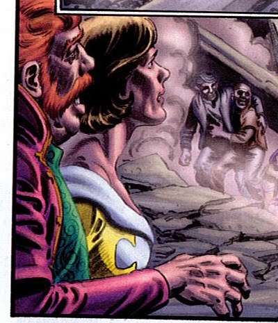
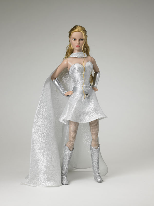
This issue gave us a lovely snapshot into Kara’s home life on Krypton. The arrangement of items in her room, the way the clothes are strewn across the chair and floor and the objects she has decorating her room all give us more insight to both Kara’s personality and Kryptonian life. Her white outfit that’s he’s wearing at the desk is evocative of 2 of the Tonner Supergirls doll. I wonder which design came first?
Kara is a typical teenager in this installment, by that I mean self centred and self pitying, and I don’t mean that as a criticism. She is convinced that her mother is sending her on all these chores in order to punish her. Her mother is actually doing it as a favour to her so that she can learn more about her new world and make an informed choice when it comes to choosing a guild.
I thought this was a great piece of characterisation. Who here hasn’t, as a teenager, been so convinced of their rightness and world view that they cannot fathom that their parents may have a different motivation for asking them to carry out chores.
This sub plot also served to further differentiate Kara from other heroes. Dinah Lance, Barbara Gordon, Wonder Woman would never have jumped to the same conclusion. Granted, they wouldn’t be put in that position because they don’t have the adult-teenage mother-daughter dynamic, but nevertheless as adult women they have maturity and an understanding of life that you generally don’t have as a 17/18 yr old. It tells us more about her and contributes to an individual characterisation that distinguishes her from not only adult heroes but also her teenage peers, Mia, Cassie Sandsmark and M’Gann M’orzz wouldn’t have had the same interpretations of her mother’s requests.
I am not faulting Kara for reacting the way she did, it’s something everyone goes through and it’s necessary as you grow up to be a mature, responsible adult. It’s really good to see that she’s not being treated as standard teenage hero model 3 and it also helps us see her growth from issue #1 to now.
All in all, an excellent issue.
Adventure Comics #1 preview
The art in this is ace. Colours, pencils, layout, all of it. It looks like the first issue is going to re-establish Connor’s place in the DCU, comparing him to Superman’s career, re-connecting him to his friends (hello there Bart!) and looking at how he performs with potential disasters. This is going to be a must on the pull list.
Currently listening to: Patti Smith's Easter.
.
.
.
.
.
.
.
.
.
.
.
.
.
Wednesday Comics #3
The Supergirl strip continues to delight, Amanda Connor’s art is lovely and I’m really enjoying the little details she’s putting in, such as the kids petting Krypto. I hear tell that this type of story is very silver age. I wouldn’t know as I haven’t read much silver age stuff, but now I’m more inclined to give the old fashioned stories a go.
Kamandi is just an old fashioned adventure story really.
Superman is still lovely – full of emotion.
Tim’s derision of Wednesdays and the violence it brings, in the Teen Titans strip, makes me chuckle. I think it’s great how this strip contains more than one group of Titans.
The Wonder Woman story is very full of information, but that doesn’t make it bad. The colours are beautiful, the lettering is really effective and I find it really interesting. This strip has received a lot of criticism, but I’m not getting that.
Flash has just got a whole lot more interesting, what with Barry visiting the future.
I no longer have any interest in Metamorpho, Strange Adventures, Metal Men, Sgt Rock, The Demon & Catwoman, Batman, Hawkman, Deadman or Green Lantern.
Final Crisis: legion of 3 Worlds #5
Oooh this went all meta! I am a big fan of these types of stories so was very tickled by the outcome of this one. Not really much else to say. We finally saw the reunion of Superboy and Bart with the Titans and respective families - the scene was set up in the same manner as that of Green Arrows return from the dead.
Green Lantern #43 (Prologue to Blackest Night)
I succumbed and placed all Blackest Night titles on standing order. Initially I wasn’t going to bother with the prologue issues but I was told that I really should get GL #43. Post reading, I’m not that bothered by it, but I guess it’s good to see where Black Hand came from since he’ll be an integral part of Blackest Night.
Green Lantern #44
J’onn is back and beats up on Hal and Barry. John Stewart is at the site of Xanshi when all the black power rings descend and proclaim the dead to Rise. As the man says, That ain’t good.
It sure isn’t!
Power Girl #3
Ultra Humanite’s ship is powered by a giant organ. Hur hur. Innuendo aside, that’s a frickin’ great idea! Terra and cameos from the JSA made the final installment of this story more interesting. I was rather enamoured of the way in which Peej and Terra rescued Manhattan. The new alien ladies look like great fun and remind me of why Amanda Connor’s art is so good.
Hopefully now that this arc is completed we won’t see any more discussion of the use or ownership of Peej’s body.
Gotham City Sirens #2
The idea of Selina getting training from Talia Als Ghul on how to hide Bruce’s secret for the world is just terrible. An awfully cackhanded way of resolving last issue’s cliffhanger.
Although the colouring and pencils in this issue is gorgoues, the gratuitous tits and ass isn’t. The scene where the criminal blokes are checking out Harley and we only see a torso, that’s not gratuitous - we are seeing her from their perspective and they only see her as a hot piece of meat.
Every other scene of Catwoman, Ivy and Harley where their breasts, bum, legs or lips take centre stage, that’s gratuitous. It is interesting that the other women in the comic (bystanders) aren’t objectified like this, so it seems to be that the artist (or editor, whoever makes these decisions) is deliberately choosing to make the 3 heroines uber sexy. While I understand that they are all sexy and each has their own way of using their sexuality, that doesn’t mean that every.single.scene. has to objectify them. When the 3 of them are together, alone, in the warehouse they won’t be using their feminine wiles on each other. It follows that the art should reflect this. Yes, they are wearing sexy costumes, but their costumes don’t require them to arch their back or for the focus to be on their hips, groin, chest or grossly distort their anatomy. I’m thinking specifically of the first splash page with Selina tied up. What is going on with Ivy’s thigh. Legs, and joints do not work that way!
Supergirl #43
Oh my I’ve been waiting a long old time for this issue. The cover is beautiful and would make a perfect poster. Kara thinks so too as she has a photo of it on her desk. That is incredibly egotistical and weird. Who has pictures of themselves on their desks? Well, I know people do, but I think it’s bizarre. It’s similar to have a portrait of yourself up in the living room…
This issue gave us a lovely snapshot into Kara’s home life on Krypton. The arrangement of items in her room, the way the clothes are strewn across the chair and floor and the objects she has decorating her room all give us more insight to both Kara’s personality and Kryptonian life. Her white outfit that’s he’s wearing at the desk is evocative of 2 of the Tonner Supergirls doll. I wonder which design came first?
Kara is a typical teenager in this installment, by that I mean self centred and self pitying, and I don’t mean that as a criticism. She is convinced that her mother is sending her on all these chores in order to punish her. Her mother is actually doing it as a favour to her so that she can learn more about her new world and make an informed choice when it comes to choosing a guild.
I thought this was a great piece of characterisation. Who here hasn’t, as a teenager, been so convinced of their rightness and world view that they cannot fathom that their parents may have a different motivation for asking them to carry out chores.
This sub plot also served to further differentiate Kara from other heroes. Dinah Lance, Barbara Gordon, Wonder Woman would never have jumped to the same conclusion. Granted, they wouldn’t be put in that position because they don’t have the adult-teenage mother-daughter dynamic, but nevertheless as adult women they have maturity and an understanding of life that you generally don’t have as a 17/18 yr old. It tells us more about her and contributes to an individual characterisation that distinguishes her from not only adult heroes but also her teenage peers, Mia, Cassie Sandsmark and M’Gann M’orzz wouldn’t have had the same interpretations of her mother’s requests.
I am not faulting Kara for reacting the way she did, it’s something everyone goes through and it’s necessary as you grow up to be a mature, responsible adult. It’s really good to see that she’s not being treated as standard teenage hero model 3 and it also helps us see her growth from issue #1 to now.
All in all, an excellent issue.
Adventure Comics #1 preview
The art in this is ace. Colours, pencils, layout, all of it. It looks like the first issue is going to re-establish Connor’s place in the DCU, comparing him to Superman’s career, re-connecting him to his friends (hello there Bart!) and looking at how he performs with potential disasters. This is going to be a must on the pull list.
Currently listening to: Patti Smith's Easter.
Friday, November 21, 2008
The last stretch of modern Aquaman..
SPOILERS AHEAD!!!!!!!!
.
.
.
.
.
.
.
.
.
.
Aquaman vol 4 seemed very disjointed. Issues 1 to 12 are Arthur gaining his new mystic water hand communing with Annwyn and saving the water goddesses. This is a more mellow less angry Arthur, partly due to his fancy new hand and not being able to strike in anger with it, lest he calls forth the Thirst again or something like it.
Issues 13 and 14 are stand alone issues, and just lovely. In # 13 Arthur saves a girl from drowning but fails to save her parents. The back story of the family’s life is feared and we get to see that despite their anger towards each other they really do love each other. Issue 14 is about other people’s perceptions of Aquaman, and is a very human very every day and ordinary life story. I would recommend picking these to up.
Next we see the American Tidal arc, where San Diego becomes Sub Diego, and this I very much enjoyed. Lorena is introduced and is pretty damn cool. She looks made for the Aquagirl outfit (first shown in a much later issue).
The deliberate genetic mutation story really caught my attention and I can’t help but wonder how Geist actually copes with living underwater, on a day to day basis. I feel very sad we saw no more of him and learnt no more before he got turned into an OMAC.
From issue 35 to 39, (the Infinite Crisis tie ins) I lost interest. I didn’t care when Garth, Vulko, Koryak, Dolphin and Cerdian seemingly died. I felt nothing when the Spectre showed up and began stomping Atlantis. Mera’s new role as an air breather was very intriguing, and her new friendship with Arthur’s sort of fling is noteworthy – a very gentle, honest and forgiving relationship. Serene almost.
I think maybe part of the reason I didn’t care about this arc (if you can call it that) is cos continuity seemed to go out the window - Garth and Dolphin’s son inexplicably became a daughter, Arthur can use his water hand in anger now and Garth appears to hate Arthur. Back in issue 12 he was Arthur’s only fan. What changed? Did I miss something?
Sword of Atlantis is good though – and the art is wonderful. Orin has become the Dweller of the Deeps and there’s a new younger Arthur Curry in town who’s stepping into Orin’s old life.
Enough of that, have some pretty:
In which the subjects of Atlantis understand why the 'net exists:
In which Orin understands truly what makes his his comrades in superheroics powerful:
A tragic panel where Mera is (apparently) dead (again) but Arthur's subjects don;t knwo this and are only aware he's defeated the bad guys and saved Atlantis:
*weeps*
And to prove I do notice when men are drawn badly too:

What is going on with Arthur's muscles in that top panel? It's a pity I didn't save the issue where he looked liked he got some sort of half inflatable half melting disease causing his overly muscled legs to twist around in impossible ways.
(and just because I'm me, note how AC isn't sexual in that panel, he's brooding, also I think it may be noteworthy to point out that it clearly looks ridiculous whereas a lot of women featured (sexualised) crap art is taken for normality*.)
*Me, keeping my feminsist credentials alive and well since 1974. ;)
.
.
.
.
.
.
.
.
.
.
Aquaman vol 4 seemed very disjointed. Issues 1 to 12 are Arthur gaining his new mystic water hand communing with Annwyn and saving the water goddesses. This is a more mellow less angry Arthur, partly due to his fancy new hand and not being able to strike in anger with it, lest he calls forth the Thirst again or something like it.
Issues 13 and 14 are stand alone issues, and just lovely. In # 13 Arthur saves a girl from drowning but fails to save her parents. The back story of the family’s life is feared and we get to see that despite their anger towards each other they really do love each other. Issue 14 is about other people’s perceptions of Aquaman, and is a very human very every day and ordinary life story. I would recommend picking these to up.
Next we see the American Tidal arc, where San Diego becomes Sub Diego, and this I very much enjoyed. Lorena is introduced and is pretty damn cool. She looks made for the Aquagirl outfit (first shown in a much later issue).
The deliberate genetic mutation story really caught my attention and I can’t help but wonder how Geist actually copes with living underwater, on a day to day basis. I feel very sad we saw no more of him and learnt no more before he got turned into an OMAC.
From issue 35 to 39, (the Infinite Crisis tie ins) I lost interest. I didn’t care when Garth, Vulko, Koryak, Dolphin and Cerdian seemingly died. I felt nothing when the Spectre showed up and began stomping Atlantis. Mera’s new role as an air breather was very intriguing, and her new friendship with Arthur’s sort of fling is noteworthy – a very gentle, honest and forgiving relationship. Serene almost.
I think maybe part of the reason I didn’t care about this arc (if you can call it that) is cos continuity seemed to go out the window - Garth and Dolphin’s son inexplicably became a daughter, Arthur can use his water hand in anger now and Garth appears to hate Arthur. Back in issue 12 he was Arthur’s only fan. What changed? Did I miss something?
Sword of Atlantis is good though – and the art is wonderful. Orin has become the Dweller of the Deeps and there’s a new younger Arthur Curry in town who’s stepping into Orin’s old life.
Enough of that, have some pretty:
In which the subjects of Atlantis understand why the 'net exists:
In which Orin understands truly what makes his his comrades in superheroics powerful:
A tragic panel where Mera is (apparently) dead (again) but Arthur's subjects don;t knwo this and are only aware he's defeated the bad guys and saved Atlantis:
*weeps*And to prove I do notice when men are drawn badly too:

What is going on with Arthur's muscles in that top panel? It's a pity I didn't save the issue where he looked liked he got some sort of half inflatable half melting disease causing his overly muscled legs to twist around in impossible ways.
(and just because I'm me, note how AC isn't sexual in that panel, he's brooding, also I think it may be noteworthy to point out that it clearly looks ridiculous whereas a lot of women featured (sexualised) crap art is taken for normality*.)
*Me, keeping my feminsist credentials alive and well since 1974. ;)
Monday, September 08, 2008
the link between porn and comics, or not...
well porn and pop culture in general really. And it should go without saying that this is obviously just my thoughts and me trying to establish them and I'm not saying I've got the definitive answer..
(or maybe I am? A-ha! we shall see!)
This post is inspired by a comment left my James Meeley at one of my previous posts. In it James said:
"I prefer my super hero comics and my soft core porn kept separate.
I'm sorry, but I just can't let this comment pass.
If you equate anything Jim Balent did on his Catwoman run (including this alternate reality mini-series) to porn (soft or hardcore) Then THAT is a true "fail." An "epic fail," as I believe the lingo of that goes.
I've read Jim Balent's Catwoman stuff and I've seen porn (soft and hardcore). Anyone who can't see a difference between the two either isn't trying, doesn't know what real porn is, or is simply a smarmy and snarky jerk (which, in MY book, is the worst of the three possibilities).
If someone doesn't like Jim Balent's art, that's fine. You want to say it is overly exaggerated or totally unrealistic, I can dig that. If you say it personally offends you, well, I'm cool with that, too. But to compare it to porn, even if only to be a snarky jerk, is a fundamental lack of understanding what porn is and how this is very different from it: in short, epic fail!"
(text in bold is quoting a comment from Toriach)
That comment led me to thinking. I have compared comic art to porn in the past *cough* Greg Land *cough* and I would still draw parallels between certain art styles and porn. But as James points out there is a difference.
I should probably point out here that I do watch porn. I am not an avid connoisseur I don't watch a lot and there's a lot of truly vile stuff out there. There's also some good stuff. But this isn't going to be a post about the type of porn I like, or even whether porn is a good or bad thing. It's also not going to be a post about whether we should have sexy women in comics.
Right, onwards with the subject. A lot of comic artists feature what I view as overly sexed up, sexualised women that have been influenced by porn. For example, there's the Jim Balent art shown in my previous post, Ian Churchill, Greg Land, Michael Turner. Although Michael Turner gets kudos for not drawing Supergirl with massive bosoms. (Unfortunately this was then negated in my eyes by the extreme low rider jeans and the knicker string pulled up above her hips, I mean, really.)
Most women in comics are depicted sexy first and 'strong' (whatever that may mean) second. Most renderings of women are in a similar style - huge boobs, tiny waist, skin tight costume, high heels. Sexed up. Thongs are everywhere. Even Raven, who I don't view as being particularly sexual in herself, is shown wearing skin tight barely there clothes under the cloak. Women in comics are objectified and judged on their appearance. Men aren't. I'm not going to go into why this is, if you disagree with me you may be at the wrong blog...
It's the proliferation of the same type of women, the same type of sexy that bothers me. I recently read Ariel Levy's Female Chauvinist Pigs - Women and the rise of raunch culture. In it she talked about the pornification of pop culture. How images and themes from porn are surfacing in our everyday public lives, where 10, 15, 20 years ago they were very much separate*. Things like thongs, full muff waxes, lap dancing acceptability, pole dancing lessons, faux sex in music videos, porn star in training t-shirts, playboy bunny merchandise (belts, clothes and kids stationery), Borat mankinis (am I pushing it here?) etc.**(EDIT)
This leads to the situation where there is only one type of sexuality on display - and it's all about women faking it. If women are copying women in porn, or being encouraged to copy women in porn, then there's no real demonstration of female sexuality. because women in porn aren't really getting off on it. (OK some may be, but the vast majority aren't in porn cos they just can't get enough sex. It's a job). Women copying or being inspired by porn are pandering to a male vision of what our sexuality is like. They are not doing it for themselves, they are doing it for men. Now there's something quite fucked up in there, especially when you consider it's a male view of what women should look like or be like before/during/after sex/to be sexy.
But back to the point, I think that this specific type of sexuality is what is displayed in comics, most of the time. Not always. For example, Renato Guedes, Alex Ross, Ale Garza, Cliff Richards, Mike Grell, J G Jones.
As mentioned above, Greg Land apparently traces his women directly from porn. Does he trace the men too? I don't know. (Still at least his women are anatomically correct). Others just use the (intended or not) pornification of our public lives and a lot of comic art is linked to porn. Maybe not equaling porn, but there is a definite correlation.
As I said at the start, I watch porn, I like some of it. I don't however want it or it's derivation in my comics and magazines. I don't think our lives should be over sexualised, I don't think women should be displayed in terms only of their tits and ass, I think there's more to us than that and I think it demeans both the viewer and the viewed when we are reduced to our component body parts, or portrayed in terms of our fuckability. But if you use porn as your inspiration that's what you get. I repeat, that's fine, in porn, when it's sole purpose is to make you get off, but not so acceptable when you are meant to be telling a story about heroics.
In short, I think both James Meeley and Toriach have valid points. But I'm siding with the view that Jim Balent's art is influenced by porn, as is a lot of other comic art.
Have I explained myself adequately? Have I even said anything at all? I shall come back and check tomorrow.
*I don't know, I'm only 28, maybe I've got my assumptions about past decades completely wrong. Can older readers help me out with feedback?
**EDIT - something I forgot to include which might help my point. All those images of women lying beaten ont he ground, with arched backs and thrust hips, gravity defying boobs, strategically ripped clothing and pouty lips. Utterly sexualised and woudl generally seem more in place in a porn mag or as a porn still than at the end of a battle scene, because it makes no bleedin' sense in context.
(or maybe I am? A-ha! we shall see!)
This post is inspired by a comment left my James Meeley at one of my previous posts. In it James said:
"I prefer my super hero comics and my soft core porn kept separate.
I'm sorry, but I just can't let this comment pass.
If you equate anything Jim Balent did on his Catwoman run (including this alternate reality mini-series) to porn (soft or hardcore) Then THAT is a true "fail." An "epic fail," as I believe the lingo of that goes.
I've read Jim Balent's Catwoman stuff and I've seen porn (soft and hardcore). Anyone who can't see a difference between the two either isn't trying, doesn't know what real porn is, or is simply a smarmy and snarky jerk (which, in MY book, is the worst of the three possibilities).
If someone doesn't like Jim Balent's art, that's fine. You want to say it is overly exaggerated or totally unrealistic, I can dig that. If you say it personally offends you, well, I'm cool with that, too. But to compare it to porn, even if only to be a snarky jerk, is a fundamental lack of understanding what porn is and how this is very different from it: in short, epic fail!"
(text in bold is quoting a comment from Toriach)
That comment led me to thinking. I have compared comic art to porn in the past *cough* Greg Land *cough* and I would still draw parallels between certain art styles and porn. But as James points out there is a difference.
I should probably point out here that I do watch porn. I am not an avid connoisseur I don't watch a lot and there's a lot of truly vile stuff out there. There's also some good stuff. But this isn't going to be a post about the type of porn I like, or even whether porn is a good or bad thing. It's also not going to be a post about whether we should have sexy women in comics.
Right, onwards with the subject. A lot of comic artists feature what I view as overly sexed up, sexualised women that have been influenced by porn. For example, there's the Jim Balent art shown in my previous post, Ian Churchill, Greg Land, Michael Turner. Although Michael Turner gets kudos for not drawing Supergirl with massive bosoms. (Unfortunately this was then negated in my eyes by the extreme low rider jeans and the knicker string pulled up above her hips, I mean, really.)
Most women in comics are depicted sexy first and 'strong' (whatever that may mean) second. Most renderings of women are in a similar style - huge boobs, tiny waist, skin tight costume, high heels. Sexed up. Thongs are everywhere. Even Raven, who I don't view as being particularly sexual in herself, is shown wearing skin tight barely there clothes under the cloak. Women in comics are objectified and judged on their appearance. Men aren't. I'm not going to go into why this is, if you disagree with me you may be at the wrong blog...
It's the proliferation of the same type of women, the same type of sexy that bothers me. I recently read Ariel Levy's Female Chauvinist Pigs - Women and the rise of raunch culture. In it she talked about the pornification of pop culture. How images and themes from porn are surfacing in our everyday public lives, where 10, 15, 20 years ago they were very much separate*. Things like thongs, full muff waxes, lap dancing acceptability, pole dancing lessons, faux sex in music videos, porn star in training t-shirts, playboy bunny merchandise (belts, clothes and kids stationery), Borat mankinis (am I pushing it here?) etc.**(EDIT)
This leads to the situation where there is only one type of sexuality on display - and it's all about women faking it. If women are copying women in porn, or being encouraged to copy women in porn, then there's no real demonstration of female sexuality. because women in porn aren't really getting off on it. (OK some may be, but the vast majority aren't in porn cos they just can't get enough sex. It's a job). Women copying or being inspired by porn are pandering to a male vision of what our sexuality is like. They are not doing it for themselves, they are doing it for men. Now there's something quite fucked up in there, especially when you consider it's a male view of what women should look like or be like before/during/after sex/to be sexy.
But back to the point, I think that this specific type of sexuality is what is displayed in comics, most of the time. Not always. For example, Renato Guedes, Alex Ross, Ale Garza, Cliff Richards, Mike Grell, J G Jones.
As mentioned above, Greg Land apparently traces his women directly from porn. Does he trace the men too? I don't know. (Still at least his women are anatomically correct). Others just use the (intended or not) pornification of our public lives and a lot of comic art is linked to porn. Maybe not equaling porn, but there is a definite correlation.
As I said at the start, I watch porn, I like some of it. I don't however want it or it's derivation in my comics and magazines. I don't think our lives should be over sexualised, I don't think women should be displayed in terms only of their tits and ass, I think there's more to us than that and I think it demeans both the viewer and the viewed when we are reduced to our component body parts, or portrayed in terms of our fuckability. But if you use porn as your inspiration that's what you get. I repeat, that's fine, in porn, when it's sole purpose is to make you get off, but not so acceptable when you are meant to be telling a story about heroics.
In short, I think both James Meeley and Toriach have valid points. But I'm siding with the view that Jim Balent's art is influenced by porn, as is a lot of other comic art.
Have I explained myself adequately? Have I even said anything at all? I shall come back and check tomorrow.
*I don't know, I'm only 28, maybe I've got my assumptions about past decades completely wrong. Can older readers help me out with feedback?
**EDIT - something I forgot to include which might help my point. All those images of women lying beaten ont he ground, with arched backs and thrust hips, gravity defying boobs, strategically ripped clothing and pouty lips. Utterly sexualised and woudl generally seem more in place in a porn mag or as a porn still than at the end of a battle scene, because it makes no bleedin' sense in context.
Saturday, August 30, 2008
Jim Balent (and Kim DeMulder) FAIL
Tuesday, May 20, 2008
I bought comics. I went splutterwhat???
The cause of this was Titans\2. What. the. Fuck. I realise that this is not a popular issue but I just thought I'd put my two cents in.
I thought the art was by Michael Turner, apparently it's by Joe Benitez. But don't worry,he's been to the Michael Turner school of art and adapted it by giving the ladeez reeeaallly big foreheads.
I really really wish I could find scans of the offending images. The first page is a tied up pair of boobs. OK so there is a head attached. It's still pornfacey. To my chagrin this didn't register as a problem until the boyfriend pointed it out, i'm so used to seeing these images.
Donna looks like a blow up doll. For some reason Raven goes to Trigon's realm and is naked apart from some strategic blue stripes, (which the dialogue acknowledges, but you know what's better still? giving her the damn cloak back).
My real spluttery moment was on page 11. Starfire is leaning over to talk to Cyborg but in such a way that when I first registered the image I thought she was all on fours looking like she was about to be spit roasted. On a second look she is actually leaning over to talk to Cyborg with her back at a 35 degree angle, to the rest of her back. And bum raised. And mouth in an 'O' of blow job. That's not pornface that porn everything.
I'm not buying this again until they get a decent artist. I shall borrow an Ami phrase *headdesk* (repeat till pass out)
The mutant shark going chomp was rather good though. And Starfire's comment about Donna's hair was pretty cute.
Green Arrow and Black Canary on the other hand was fucking awesome! OK so, I have a giant crush on these two. The cover is fantastic, I love the inside art and Mia and Dinah cooing over English bloke is sharp. And Ollie's moody respsone just made me laugh (in a good way). This is Judd Winick being good (anyone coming here from WFA will probably violently disagree with me on this *ducks and hides*)
Huntress yr 1 \1 was also made of much much win. No cheescake! No T&A! No gratuitous cleavage! No huge boobs (ok maybe one panel, but I'll let that go)! Win win win win WIN. Moody, dark, regal, gorgeous. This is what comics can be, give me more.
I thought the art was by Michael Turner, apparently it's by Joe Benitez. But don't worry,he's been to the Michael Turner school of art and adapted it by giving the ladeez reeeaallly big foreheads.
I really really wish I could find scans of the offending images. The first page is a tied up pair of boobs. OK so there is a head attached. It's still pornfacey. To my chagrin this didn't register as a problem until the boyfriend pointed it out, i'm so used to seeing these images.
Donna looks like a blow up doll. For some reason Raven goes to Trigon's realm and is naked apart from some strategic blue stripes, (which the dialogue acknowledges, but you know what's better still? giving her the damn cloak back).
My real spluttery moment was on page 11. Starfire is leaning over to talk to Cyborg but in such a way that when I first registered the image I thought she was all on fours looking like she was about to be spit roasted. On a second look she is actually leaning over to talk to Cyborg with her back at a 35 degree angle, to the rest of her back. And bum raised. And mouth in an 'O' of blow job. That's not pornface that porn everything.
I'm not buying this again until they get a decent artist. I shall borrow an Ami phrase *headdesk* (repeat till pass out)
The mutant shark going chomp was rather good though. And Starfire's comment about Donna's hair was pretty cute.
Green Arrow and Black Canary on the other hand was fucking awesome! OK so, I have a giant crush on these two. The cover is fantastic, I love the inside art and Mia and Dinah cooing over English bloke is sharp. And Ollie's moody respsone just made me laugh (in a good way). This is Judd Winick being good (anyone coming here from WFA will probably violently disagree with me on this *ducks and hides*)
Huntress yr 1 \1 was also made of much much win. No cheescake! No T&A! No gratuitous cleavage! No huge boobs (ok maybe one panel, but I'll let that go)! Win win win win WIN. Moody, dark, regal, gorgeous. This is what comics can be, give me more.
Sunday, November 25, 2007
This is not Artemis
Artemis - Wonder Woman art for sale on ebay
Artemis - different hair. not asian. wears clothes. If you wish to sell titillating manga style pictures, by all means do so. But please do not label it Artemis unless you wish it to be recognisable as her.
Edit - actually, I don't mind her being asian. I mind her being generic with no individual recognisable characteristics.
Artemis - different hair. not asian. wears clothes. If you wish to sell titillating manga style pictures, by all means do so. But please do not label it Artemis unless you wish it to be recognisable as her.
Edit - actually, I don't mind her being asian. I mind her being generic with no individual recognisable characteristics.
Subscribe to:
Posts (Atom)