Showing posts with label comic art. Show all posts

Friday, June 26, 2015

Commissions by Princeless artists

I promised I'd put something up about this weeks ago, so here goes:

Ted Brandt and Rosy Higgins, the artists of the most recent Princeless volume, The Pirate Princess, (and who I interviewed here), are doing commissions.

They came up with this rather excellent way of showing their rates:

I've not seen a graphic quite like that before, and I think it's ace.  Consider asking them for a commission why don't you?

Sunday, April 05, 2015

LSCC write up

I've not done very well at writing up a review of the day.  I can't really be arsed to write a full review, so what will follow are a few short thoughts and some pictures.

I got this lot signed:


Which is:
Superman/Batman: Vengeance, signed by Ed McGuiness and Dexter Vines.  I'd been queuing for about 45 minutes and they were about to got for a signing so I'm very glad they took an extra 30 seconds for me.  Standing for that long when pregnant and when you need a wee is not fun... I took this along as it's the story with lots of Supergirls.
Supergirl 26, signed by Yildray Cinar.  I told him I liked his sexy Lobo.
Supergirl: Bizarrogirl, signed by Nei Ruffino.
Supergirl 9, signed by Mahmud Asrar.
Red Lanterns 28, signed by Alessandro Vitti.  I told him I was one of the complainants when I first heard about RL Kara, but this issue completely changed my mind and I actually really enjoyed the arc.
World's Finest annual 1, signed by Paul Levitz.
Superman: Silver Banshee issue 1, signed by Joyce Chin.  She said these issues were a lot of fun to do.
Princeless Pirate Princess 1, signed by Jeremy Whitley, Rosy Higgins and Ted Brandt. It was good to finally meet them face to face, although I fear I may have been a bit awkward at them.  I convinced my friend to buy copies of the books.

I wanted to get Supergirl 38 signed by Emanuela Luppacino but she was only signing at pre-agreed sessions, and I didn't have time to see her.

I bought this pile of comics, a couple of which I may already have, but what the hey:

Me and my friend went dressed as Supergirl and we found the Daily Planet:


And my most favourite thing of the whole day...
Ian Churchill was there selling lots of stuff, including sketches and pencilled pages from his time on Supergirl.  He had a page of his concept sketches from that run... so I bought it:
I am beyond thrilled with this.  I love seeing these ideas he sketched out. I love the dynamism of the poses and the (mostly) cheerfulness radiating out of Kara, particularly in those two poses on the bottom left.  I adore the sketches of her in flight.  I like that there's not much on her face apart from mouth and eyebrows  The body language gives us enough of her mood.  The only things I don't like are the comments about super pmt and getting a Kryptonian pregnant.  I'm not having a political strop about it, it's just those ideas aren't to my taste.  They are interesting when you think in terms of where the story was at the time, so I'm quite happy to have them on there.

I now need to figure out what to do with this.  It's just larger than A4 size so finding a ready made frame will be an arse.  But just having it on a shelf seems like a shame.  I'll have to have a think.

This cost me £50 and I have no idea whether that's reasonable or not.  I decided to pay it because I had the cash in my wallet, and I really really liked it.  So much so I was giggly for the next 45 minutes, and I ran up to Daniel Clifford who writes these great comics and squealed at him about it.  I'm quite reserved and I've only met Daniel at cons so this should give you an idea of my excitement.

Wednesday, March 04, 2015

"Finally, comic book women get a real bodies make-over"

Title in quotation marks because redraws have been going on for years.

I am referring to this article which has been doing the rounds.  A facebook friend asked me what I thought of it so I thought I'd tidy up and post it here.

The motivations of the team behind this are explained as follows:
When the team at bulimia.com saw Buzzfeed's Disney princess makeovers, they decided they should take these super-human ladies and give them some super human bodies. Their hope is that when viewers see these realistic waistlines, they will be able to better relate to the characters. After all, being powerful doesn't have to correlate with being a double-D, size 2 cat lady,

I'll admit that I'm more inspired by men's physiques in comic books than I am by women's physiques.  I'm not sure if this is because I have a fairly relaxed attitude to gendered bodies or because men are shown as being more muscular than women, but if I think about who I most want to look like it's hook handed Aquaman, every time.  I know I'll never look exactly like him, I know his physique is caricatured, but when I think of visual motivation for working out and getting a six pack he's who I think of.

I don't lady comic characters unrelatable because they can be drawn ridiculously.  I think the world of Wonder Woman, even when she's drawn by Mike Deodato.  Relatable doesn't just mean 'looks like me'.

Having said that, I like the idea of re-drawing characters to look more normal.  It made me realise that some art which I consider realsistic really isn't - the thigh gaps for example.  I think that some of the redraws aren't quite right though - they aren't athletic enough.  There's a difference between tits an ass, normal realistic bodies and athletic.  I don't think there's a problem with making superheroes (and villains) look atheltic if their power set and skills demand it.  For example, the Flash should look like a runner.  Guy Gardner is an ex PE teacher, John Stewart is an ex marine.  I'd be surprised if they didn't keep fit, but they shouldn't look like triangular beefcakes.  Aquaman and Mera should look like swimmers.  Batman and Black Canary should look like martial arts experts.  Wondy should look like a gladitorial athelet.

Some of the redraws don't look right.  Black Widow doesn't look as fit as a physically active spy should be.  Her spying is a core part of her character, and if she doesn't look right I can't relate to her.  If she looks like she spends more time behind a desk than out in the field I'm not interested.  Catwoman, Ivy, Power Girl and Phoenix work for me.  Rogue doesn't.  Given the amount of time the X-Men spend training she shouldn't be as soft as that around the middle.  The same goes for Storm.

In making these characters look like normal everyday women that we can now supposedly relate to, they've taken away some of the power fantasy.  If I'm going to be inspired by a superhero I'll be inspired by their strength of character, their morals and what they can do with their bodies and how capabel their bodies are - but I'm someone interested in fitness and what exercise and training can do to the body.  Not everyone is.

To simplify, often lady superheroes are drawn to be fancied by men, and male heroes are drawn to be power fantasies for men.  Female characters should be power fantasies for women too, but to dot hat, you have to understand how bodies and exercise work.

Thursday, February 20, 2014

Bendis New Avengers - good art

Here's some pages I particularly like.

These 3 are all from New Avengers 23:

The layouts, the colours, the pencils *swoon*

From New Avengers 30:
The colours!  Dr Strange brings all the colours.

From New Avengers 39:
That's just a lovely page of Echo.

Monday, June 10, 2013

More X thoughts

I'm now up to Uncanny X-men 272 - the X-tinction agenda.

I am confused about Jubilee's powers - does she just produce light or does she produce explosions as well?  If so, what is she exploding?  Does she create something combustible?

Thinking more on the art, although the adults tend to have the same body type, either muscular male or leggy slim women, the anatomy is largely correct.  The women aren't (usually) put in sexual poses, there aren't any escher girls.  The poses and actions are on the whole, feasible.  I guess you could say that the women's legs are too long and the men's muscles aren't 100% accurate, but I don't have a problem with that, because that's the artist's style.

I was under the impression that Wolverine was meant to be attractive, rather then a short hairy animal.  I guess that's what Hugh Jackman and Hollywood does for me.

I'm enjoying the letters pages.  In the back of 270 there is a suggestion from a Londoner about who should be cast in an X-men film.  She suggests Arnold Schwarzenegger as Colossus, Grace Jones as Storm, Madonna as Dazzler, Dennis Quaid as Havok and Julia Roberts as Storm.  The editor suggests Clint Eastwood as Wolverine.  Bearing in mind that this was in 1990, what do you guys reckon to these suggestions?  I think they are pretty good.

Sunday, June 09, 2013

Comics review 8/06/2013

So this week I have mostly been reading Fearless Defenders 5 and 1990s Uncanny X-Men comics.  Thoughts follow after the break.

Thursday, April 18, 2013

Elysia - a new comic about angels

I recently did my first Kickstarter pledge. It’s for a new comic called Elysia, and it’s a sci-fi fantasy story about angels.
I’m blogging it because they’ve got 5 days to go and just £883 left to raise, and I’m desperate to get it funded!
Here’s the link: http://www.kickstarter.com/projects/serenaobhrai/join-elysia-on-her-journey
There is also a twitter account: https://twitter.com/ElysiaComic

There will be 3 chapters, each of at least 100 pages. The main reason I’m backing it is because Jennie Gyllblad is doing the art. Long time readers will probably know how much I adore Jennie’s work. I’ll pretty much buy anything she does. I realise that my love for her work is probably not enough for most other people, so here’s some links for you to check out:
Website: http://jenniegyllblad.com
Prints for sale: http://jenniegyllblad.com/shop.php
Art: http://jenniegyllblad.com/art.php
Jenspiration, her webcomic: http://www.jenspiration.co.uk/
My review of Clockwork Watch, for which she did the art: http://www.paipicks.blogspot.co.uk/2013/01/clockwork-watch-arrival.html

Serena Obhrai is writing the comic, her blog is here: http://serenaobhrai.com/. Outside of chatting on twitter (where we have recently been discussing, with Jennie, the comparative hotness of Thor vs Loki) I don’t know Serena or her writing at all. I’ve had a quick glance through her blog and her prose seems good.

Here’s a synopsis of the story of Elysia:

The story is set in a fictional future where humans and their guardian angels live side-by-side and all angels must abide by the Three Angel Laws (inspired by Isaac Asimov):

• An angel must obey the orders given to it by The Higher Order of angels.

• An angel must serve to guard and protect their designated humans at all times.

• An angel must not engage in an act of fornication with a human at any given time.
The laws are mostly adhered to, however, there are some that choose to break them. Our story is set around the consequence of two such beings - Max and Devi - whose offspring has to suffer the harsh consequences and reality of her human scientist father and angel mother's choice to procreate, causing Elysia's wings to grow upon hitting puberty.
As her wings form, and she becomes an angel, Elysia has to face the fact that she is no longer human and must come to terms with the challenges that lie ahead with accepting her new form. Having been born with a lot more power and responsibility than she can accept, we follow Elysia on this epic coming-of-age journey where everything she knows no longer exists.
All the teenage angst involved with finding your place in life is nothing compared to the trials and tribulations that Elysia is faced with when confronted with the reality that she is the only key to stopping the Fallen Angel attack that is about to take over the world and all its inhabitants.
Each chapter will be printed in full colour, sized 260mm by 170mm and 100+ pages of awesome. The covers will be glossy and the page and print quality will be high to support Jennie's art style. We're pulling out all the stops to make sure this first print run is of the highest quality for you.
So it’s a coming of age story. Yeah so that’s not a new idea. I don’t think that matters, fantasy and sci-fi stories are full of similar tropes, what makes a story is good is the way in which it is executed. I have every faith that this team will be able to produce an excellent, engaging story. I know for sure that the visuals are going to be amazing.
Please consider backing this kickstarter! If they don’t reach their target no money will be taken and the comic will not get made. And that would make me a very sad bobbins indeed. And it would leave the comic industry that much poorer.
Thanks for reading.

Friday, January 04, 2013

Not a Wonder Woman Wednesday


This image has so many things right with it.  Her pose, her strong, muscular, powerful back and arms.  The intense emotions of regret and sadness.  But then Ed Benes goes and ruins it by exposing her arse.  If he had just given her some pants that covered her arse cheeks, this would be beautiful.  Unfortuantely the emotion and power is mocked by Benes apparent pathological need to display women's arses.

Friday, March 02, 2012

Perfect, perfect comic panel


Perfect colour,s perfect motion, perfect perspective, perfetc layout, pefect design.

Perfect.

Found on Slay, Monstrobot of the Deep!

Thursday, February 23, 2012

Reynard City art

I found these couple of scans on facebook.  They are teaser images for an upcoming Reynard City issue.
 
I really like them, especially the black and white one.  It's a really clear, clean art style.  My only critiques are that it might make more sense for the left hand bottom panel to be on the right hand side instead, and the pose in the bottom panel is a bit awkward.  I think her body should be more vertical and less horizontal.  But hey, she's a fox (literally), maybe humanoid foxes have different skeletal structures.

Even with those comments, it's still a pretty good comic page.  I like the layout and I love the sense of perspective and movement you get in the middle and bottom right panels.

Good stuff.

It's done by Susie Hampton, you can see more of her stuff on her deviantart account.

Monday, February 13, 2012

On the idea of 'sex sells'

Cross posted from here, the following is an comment on the idea of 'sex sells' in relation to comic book art, particularly women of the escher variety.  ----->>>>


Beast of the Sea, I don’t know who you are, since you only contribute Anonymously, but I love you more than words can ever express.
In response to that anon, let me expand on the last point:
“P.s. the x ladies are looking mighty hot lately, hope Land doesn’t read your blog and tone down the ladies”
Tone down the “lady”, you mean, since all of Greg Land’s women look nearly the same. In fact, in a tutorial, he advises the potential artist to “Draw the kinds of features readers expect to see on this sort of character, including full lips, a petite nose, and eyes that have a nice darkness around them to draw the reader’s gaze to the pupils.” and “Since this is a glamour sketch, go for the aesthetic of the “ideal” female form. Draw longer, thinner limbs.” In short, he has an ideal in his head, and he draws women to strictly match that ideal.
Now, what’s the problem with this, you ask? After all, male superheroes are all drawn to match a ideal male form, too.
Well, because that ideal male form has variance. There’s the short and hairy Wolverine, the slimmer (sometimes) Cyclops, the bulky Colossus, etc. Robins have leaner builds than the Batman himself. Reed Richards is usually long and thin (as one might expect from Mr. Fantastic). Even with the mandatory Greek-god physique, there are different versions of that physique. And the faces! Even though there is a default square-jawed, glowering-brow facial structure, heroes do vary from that - Spiderman is usually one such, right? - and even within that structure, if Superman and Batman are in the same comic together, the artists usually make an effort to distinguish one black-haired Caucasian male from the other.
Greg Land’s women, on the other hand, all have “longer, thinner limbs”, big bosoms, wide shoulders, thin hips, full lips, petite noses, and heavy eyeliner. And they have a tendency to get caught with their mouths wide open in a certain manner, though I’ll omit the usual speculation as to why.
I’ll even concede that it may not be due to tracing similar-looking models, because his tutorial showed him transforming a model who did not look like his usual lady into one who did. He does it by choice, not by incompetence.
Riiight, you ask, so what’s the problem with this? It’s a hot lady, even if it IS the same lady modulo different skin-tones, hair-colors, and costumes, it appeals to you, it’s pretty art, so what’s the problem? Sex sells!
On the solely “sex sells” front, I have to ask why more male characters aren’t drawn to appeal to women or gay men, since they’ve got money too. Now, I like muscular fellows, so some comic art looks rather good to me… but I’ve noticed that How To Draw [American] Comics books tend to have one tutorial minimum on how to make women look “sexy and alluring” (sometimes an entire section), whereas the tutorials for men are more along the lines of ‘how to make the hero look powerful’, with notes along the lines of ‘A thin waist makes a character look sleek, whereas a thick waist just makes him look brutish’. That’s very nice, but where are the tutorials on making men sexy and alluring, again? If sex sells, shouldn’t we be aiming to sell sex to the widest market possible?
Again solely from a “sex sells” perspective, not all men will like the same body type and facial features that Greg Land apparently prefers! Some men like wide hips - the famed “hourglass figure” is not a “funnel figure”. Some men like women bigger, some men like women slimmer (Difficult, you say? Shrink the shoulders to match the hips), some men like women shorter, some men like women taller… and Greg Land draws each and every one with about the same height and build. In this sense, he’s actually shrinking the “sex sells” market by excluding every fellow whose tastes markedly differ from his. (And yes, it is possible to have athletic women who do not all look like Greg Land’s woman. They may all have the same muscles, but if you slap them down on top of different skeletons, they will not look the same up to a change of costume, wig, and skin-tone! I mean, is every superheroine Greg Land draws secretly played by the X-Universe’s Lady Gaga?)
Oh, and by the way, Greg Land has been criticized for making even middle-aged mayors and scientists look the same as all the superheroines, so the idealized-female-form argument wouldn’t apply to all his stuff even if I conceded utterly to it. But I think I’ve spent enough time on the “sex sells” argument as it’s currently used.
As for other problems with his single woman - that single woman has facial features typically associated with Caucasian supermodels. This may make sense when on a Caucasian woman, but not all the women he’s supposed to be drawing are Caucasian. I’m trying to phrase this delicately, and I think it works to say that this choice declares “mighty hotness” to be the exclusive province of women with Caucasian features… and not just Caucasian features, but a specific subtype of Caucasian features. Not only is this ludicrously racist (though I do not claim this to be Greg Land’s intent - I am sure he is a quite friendly and unprejudiced guy in person), but I am sure that many, many men (and women!) would disagree that only a specific subtype of Caucasian features grant a woman “mighty hotness” - Sorry, I said I would drop the “sex sells” argument, didn’t I? Well, it’s the supposed magic bullet against any objections to sexualization and stereotyping of women in comics, so I figure it’s high time for it to be used to return fire.
Back on the “men are idealized too” front - teenage boys and young adult males look markedly different from older men in comics. The Robins are not drawn as miniature Bruce Waynes, never have been, and never will be. Even the Dread Rob Liefeld did NOT draw all male characters with the same build and facial structure - he has two male body types (muscular and torso-wide-as-it-is-tall), but he has two different male body types. And since Rob Liefeld is all but regarded as the Comics Antichrist, I think that drives home that male characters really are given multiple body types. One could probably argue that he has two different female body types, too - close-to-normal and severe-scoliosis-sufferer - but that’s a subject for different blogs.
Greg Land, on the other hand, draws teenage girls, young adult females, and adult women as having no appreciable difference whatsoever. There is no change in facial structure or body shape to tell the two apart - 14-year-old Hope looks nearly-identical to Jean Grey in her 20’s or 30’s. All of his females after the age of menarche have the same body. And you cannot say that about his males.
Yes, his males have issues with exploding biceps, but that’s a different matter…
TL;DR - Greg Land’s art has problems with the ladies, and it goes beyond bad anatomy, tracing, and the possibility of needing to be “toned down”. Even if you look only with an eye to “mighty hotness”… there’s a problem.
[Final disclaimer - no, I am not calling Greg Land racist or sexist, I am not calling the anon racist or sexist, I am not calling your houseplant racist or sexist, I am not calling anyone racist or sexist. I am criticizing Greg Land here solely for his artistic choices, which have certain unpleasant side effects. I am sure any unpleasant side effects are wholly unintentional. Sorry, a recent binge on reading the comment-sections of Wundergeek’s excellent blog has made me paranoid.]
By way of an apology to the mod for clogging up her Tumblr, here’s a truly spectacular example of the big-shoulders small-hips thing I was talking about [Again, that Photobucket account is not mine - I don’t even have a Photobucket account], and an amusing collage of Greg Land’s women by a guy here on Tumblr. (Please note the tags.) I just wanted to go into detail on the ‘Well, at least he draws hot women!’ argument, since it’s apparently one of his big selling points.

Friday, January 20, 2012

Gender bent Justice League

Artwork of that group of cosplayers that turned up last year (or the year before?) on the America con circuit.  Simply fabulous.

It's by Yasmin Liang.

Friday, January 07, 2011

This could be a mural

Last of the Animal Man scans I promise.  But what a beautiful thing to end on!

I love everything about this.  The colours, the layout, the pencils, everything.

That's all for Animal Man for a while, coming up next: the JLA!

Wednesday, January 05, 2011

Animal Man artwork...

..from inside the covers this time.

I saved these scans from when I first read the run, back in November now.  I still find them striking, so again I am sharing them with you.


These are from issues 52 and 53 where Animal Man had died and had to fight his way back up the evolutionary chain to become human again.  These artists are *so* talented.

Tuesday, January 04, 2011

Animal Man covers

Animal Man gabe us some really great covers, and in leiu of a better blog post, I thought I'd share 3 of them them with you.


They've got more in common with real artwork than your regular comic art.  The middle one I particularly love, I find it very moving.

Tuesday, December 28, 2010

Following on from the Tower of Babel, Bats and Supes unmask

I just wanted to share a couple of scans with you, from JLA 50, where Batman and Superman unmask.  In the preceding issues the League had been nearly destroyed by Ra's Al Ghul, who had got hold of Batman's secret plans to neutralise (read, seriously fuck up) his colleagues.  As you can imagine there some feelings of mistrust within the League after this.  Batman and Superman decided to try and resolve this feeling by unmasking to the whole league for the first time.  Here is how they decide to do it:


See the severity in the first scan?  Can you feel the anger and awkwardness in the panels?  You don't need to have read the comic to understand the atmosphere within the room.  You can easily imagine the sort of conversation they were having prior to those panels.  Compare that to the second panel where Clark is so full of life and so bashful.  These are really wonderful pieces of comic art.  Credits as follows:
Mark Waid: Writer
Ken Lopez: Letters
Laura Depuy: Colours
Then the Inks and Pencils could be any of these:
Inks: Paul Neary, Kevin Nowlan, Drew Cerraci, Walden Wong
Pencils: Bryan Hitch, Phil Jiminez, Ty Templeton, Doug Magnke, Mark Pajarillo.

All are credited as contributing to this bumper issue.  If someone could clarify who is responsible for the above scans I'd be grateful.

Saturday, September 11, 2010

It's Beefcake week!

Or so Sally has declared.

Works for me, here's my contributions.

First up, is Thugboy from Empowered:


Last up, is Arthur, demonstrating why he's awesome:

Tuesday, August 31, 2010

bum bum ba BUMMM!!

Look what I came across while reading Daredevil - Wake Up:


Quite apt that my scan accidentally cut his head off don't you think?


Lets take a closer look:

See they don't have to be green to be good!

Edited to add that I put a review of this book up on New readers... if anyone is interested.  there's no bum over there tho.

Tuesday, August 03, 2010

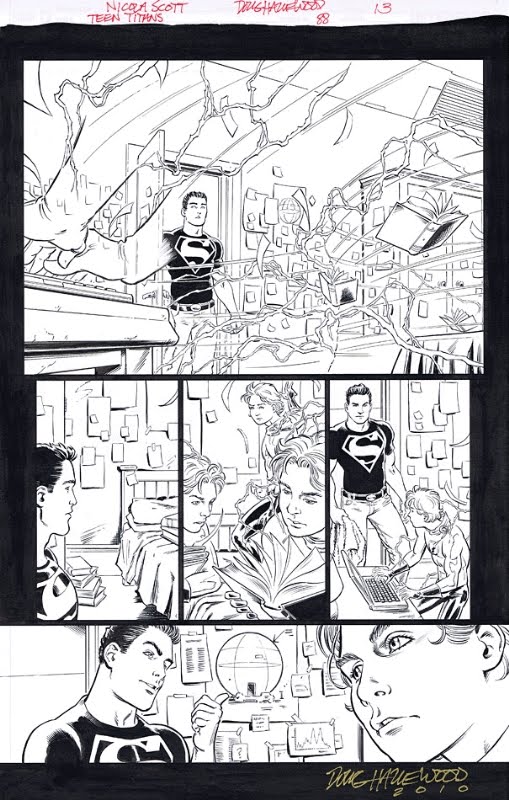
Nicola Scott on Teen Titans

heartbart has a preview page up of Nicola Scott's artwork for Teen Titans.


Ahh I don't really care if the writing's crap, the art is gorgeous!  Such a lovely Bart, and such a square bodied Con!  Oh I am so looking forward to this.

And you can buy this page!!  Be still my swooning (skint) heart.